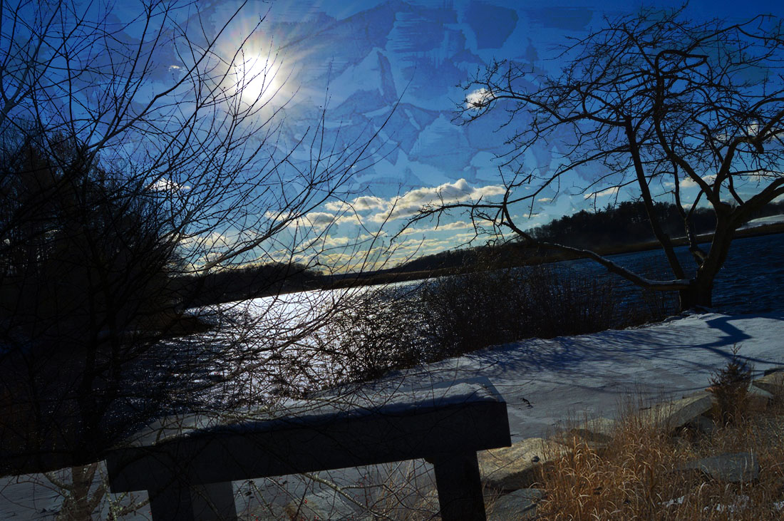
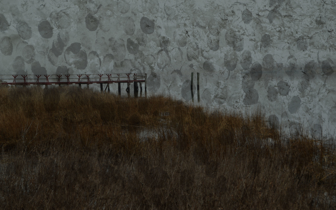
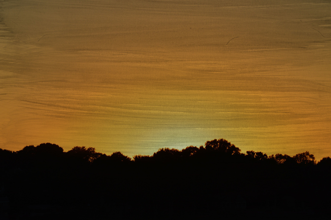
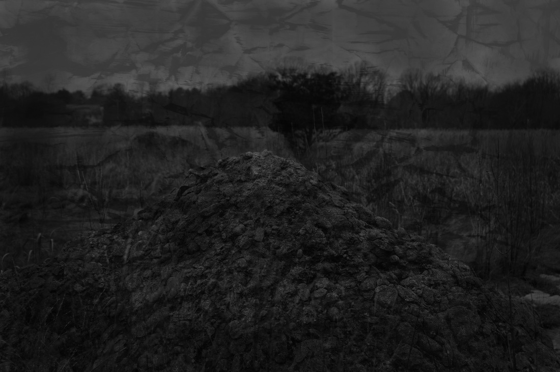
For my series, I decided to design around the theme of nature. I used color and black and white to help show to the beauty and darkness of nature. The variation between the color and darkness in my images helps create this theme. The darker/deeper black and white images create a sense or darkness, while the brighter more colorful ones contrast it to it's beauty. The deeper more enforced textures also help to show darkness in the series. The sun coming through in some of the images, help create a sense and happiness and beauty throughout the series, still will a small piece of darkness due to the added textures.
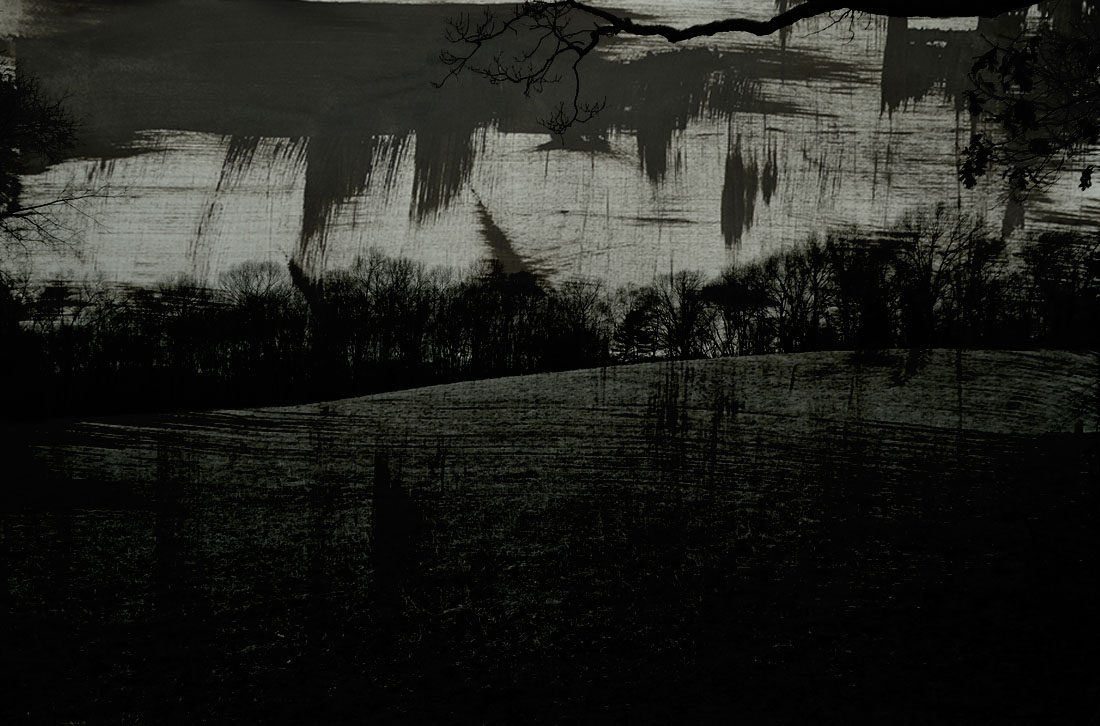
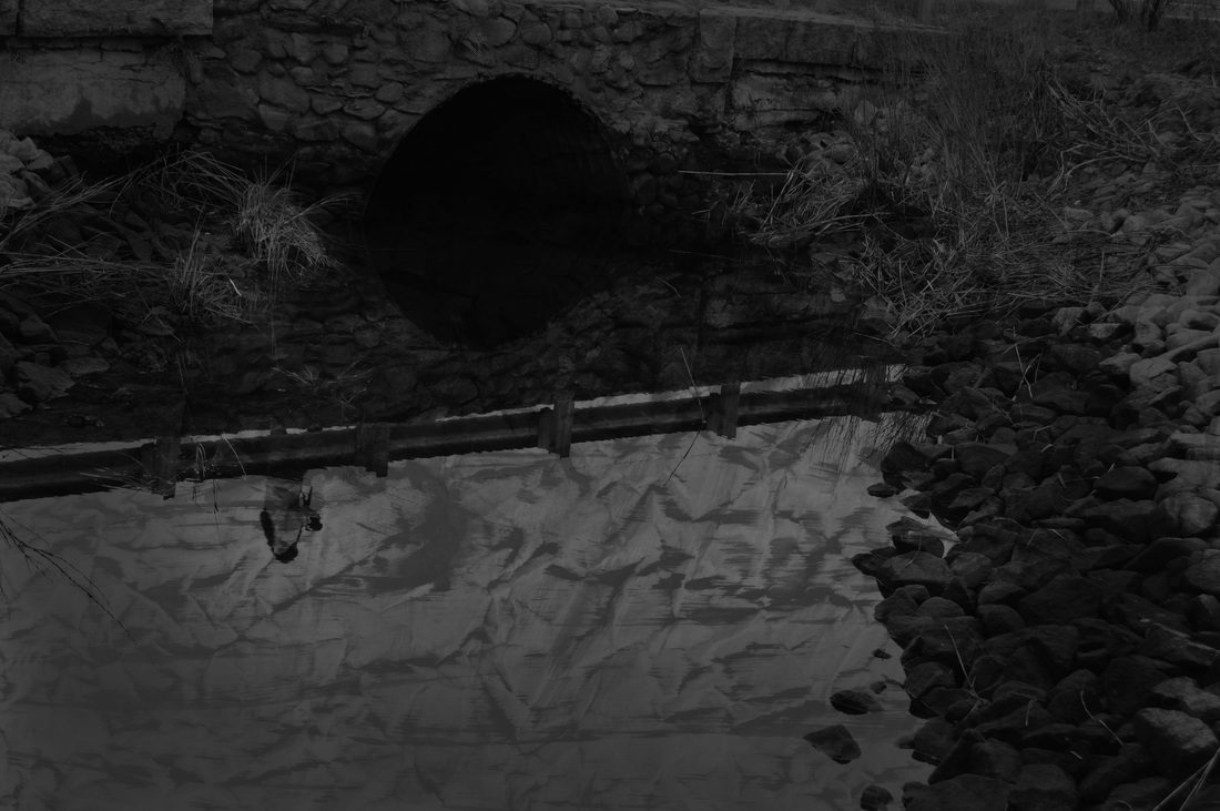
One of my favorite photos from the series is the bottom middle one. The black and white image with the bridge, showing the girl walking by. The texture(s) that are placed in the water are very strong is creating emotion/ a sense of darkness. The Darkness is created by spookiness. The deep contrast from black to white gives it strong feeling. In creating this image, I used several different layers including textures, Vignette, erase, and black and white. The composition and range of value in this photo make it successful. The image is more successful than the original image, because it is no longer boring and has deep textures that move your eyes across the image.
One of my favorite photos from the series is the bottom middle one. The black and white image with the bridge, showing the girl walking by. The texture(s) that are placed in the water are very strong is creating emotion/ a sense of darkness. The Darkness is created by spookiness. The deep contrast from black to white gives it strong feeling. In creating this image, I used several different layers including textures, Vignette, erase, and black and white. The composition and range of value in this photo make it successful. The image is more successful than the original image, because it is no longer boring and has deep textures that move your eyes across the image.
